Web Design Journal
Various things designed. Sometimes incomplete or in progress. Sometimes used, sometimes not.
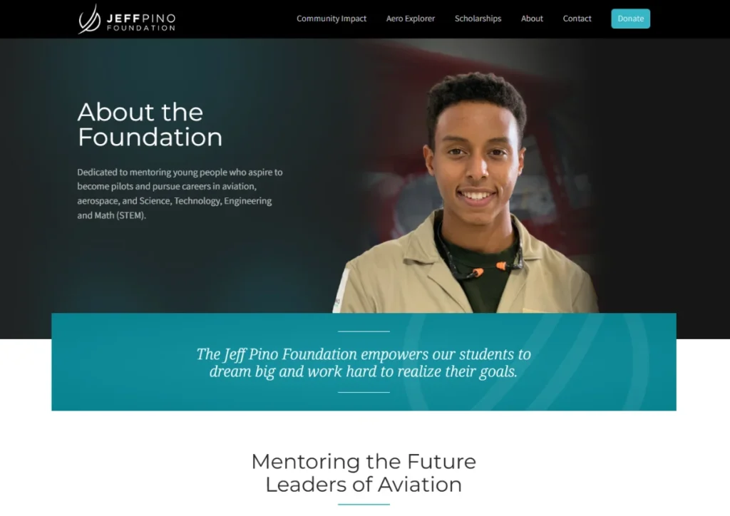
There are a few hero sections that I think turned out pretty well on the Pino Foundation website. Hero sections, and specifically images within them can be difficult to get right. This one blends into the dark background, and fades off pretty nicely on each end, and I really like the dark tones with the teals.
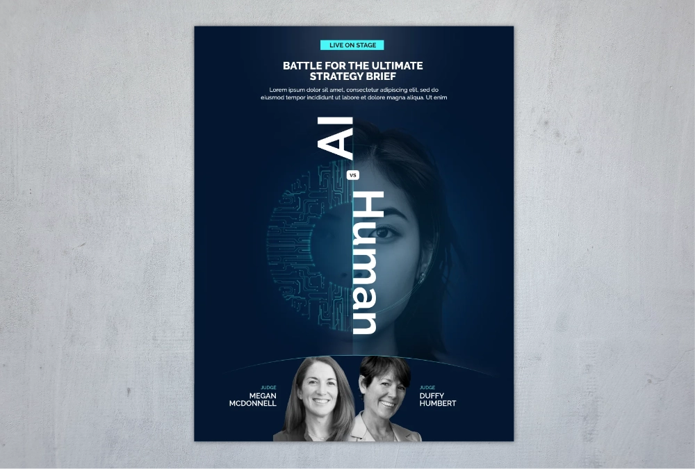
This was a fun project promoting a live event at a conference: a battle between AI and humans to create a marketing project brief. I tried to make it futuristic feeling to reinforce the AI aspects, and I think the colors and overall feel of the design ended up working pretty well. I love how the woman's eye peaking out from behind the "U" turned out, it's just a fairly piercing look.
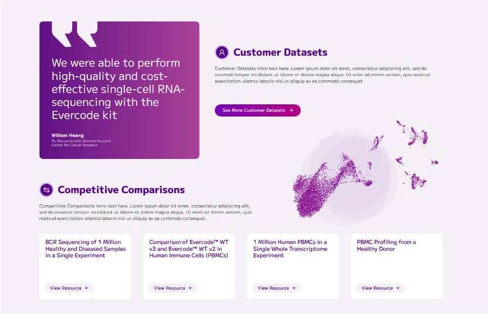
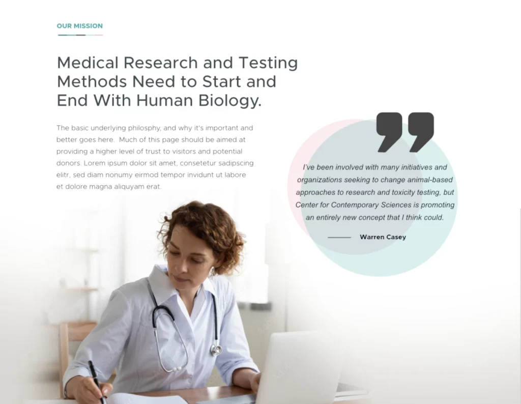
This is part of a larger page (which has numerous sections that I think turned out well), but I just really love how the testimonial turned out. I've since adopted this style for the rest of the site and have been working on swapping out the older design with this cleaner, more vibrant design.
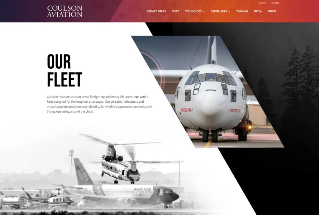
There will be some more work on this, and other sections similar to this in the future, but for now I'm still happy with the overall composition. The angles come from the markings on their aircraft, but the connections between that and the angles used fairly profusely on the website could be stronger. Still, the various images, shapes, colors, and black-and-white treatment works pretty well and creates a pretty dynamic introduction for the page.
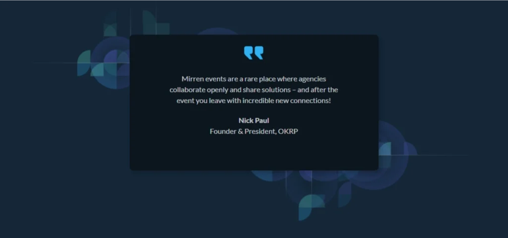
I quite liked this testimonial box I found while reviewing an old website that I had designed and developed. The pattern, which I previously had posted makes for a nice backdrop, and the testimonial tile with a fairly heavy shadow creates some nice depth.
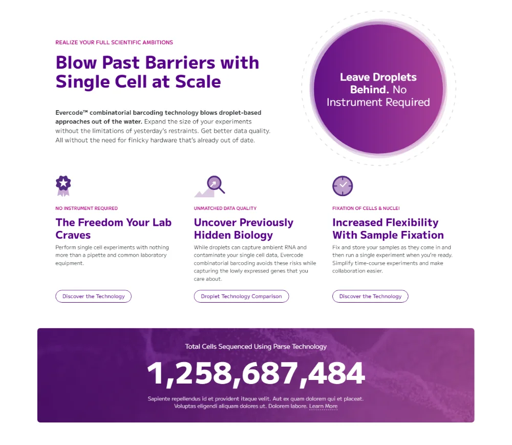
This updated design for the intro section on a home page was a major improvement on the existing design, which had a very disconnected and sloppy feel, along with some bad user-experience (hiding some content behind tabs, that didn't actually feel like tabs).
This new design streamlines all of the content, uses a better hierarchy of headings, brightens the overall feel, and even introduces a new element -- the total number of cells that have been sequenced using the company's technology (which was also a fun little programming project).
Part of a larger landing page design, this illustration was great fun to work with. It was one of those instances where the client just specified a list of items to display and on the page. It would have been fine to present it in that manner, but there was an opportunity here to do something more interesting and memorable.
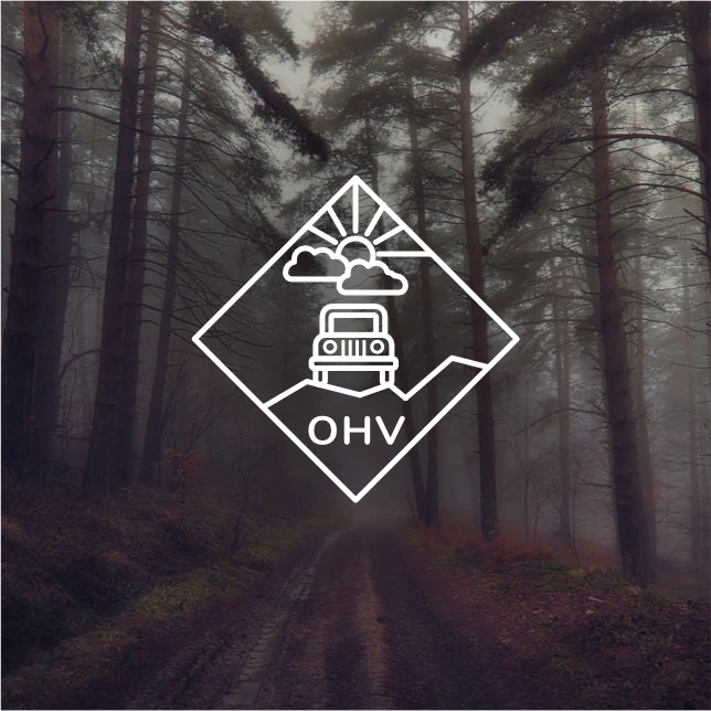
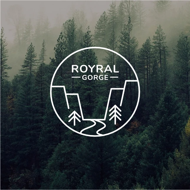
A series of icons for a tourism-based non-profit. These, along with a few others I designed, work together on a single page to represent specific adventure-based pages.
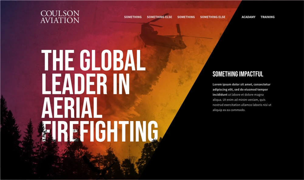
A second (or perhaps sixth or seventh) version for a hero section for a company specializing in aerial firefighting. Based on previous versions, the client wanted something grittier and less refined.
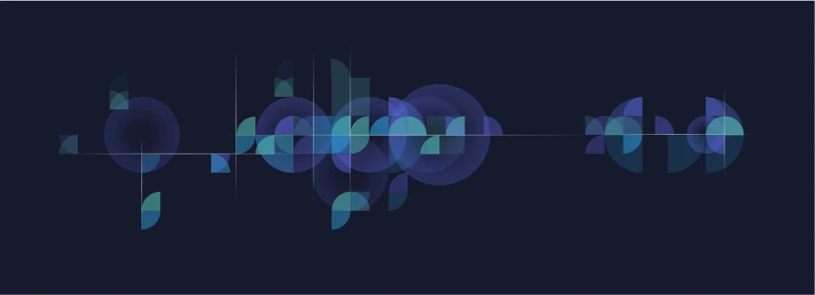
A created a few patterns within this same style for a website. Sometimes used as backgrounds, or to frame other elements. It's oddly difficult at times to get moderately random arrangements like this to work, but I quite liked how this one turned out.

Designed for the top of a page that lists out this company's webinars, this section displays their most important upcoming webinars. This version aims to be quite a bit clearer and easier to read than the previous version, where the webinar date was hiding within the other content and the speaker listing was, well, just a list. Since the company does have images for each speaker, it made sense to use those images to add more life to the design.
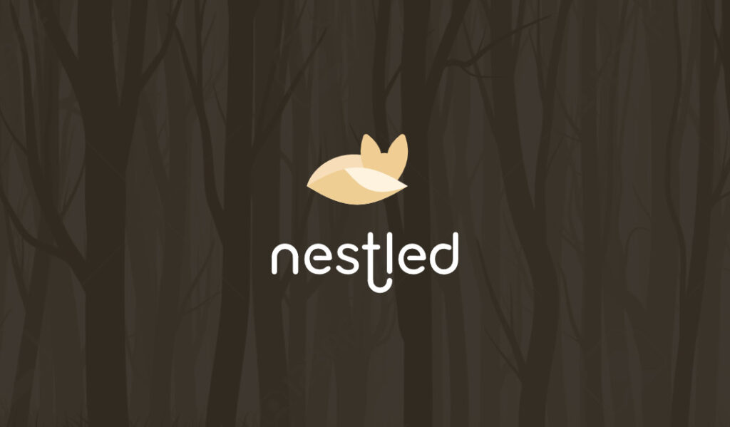
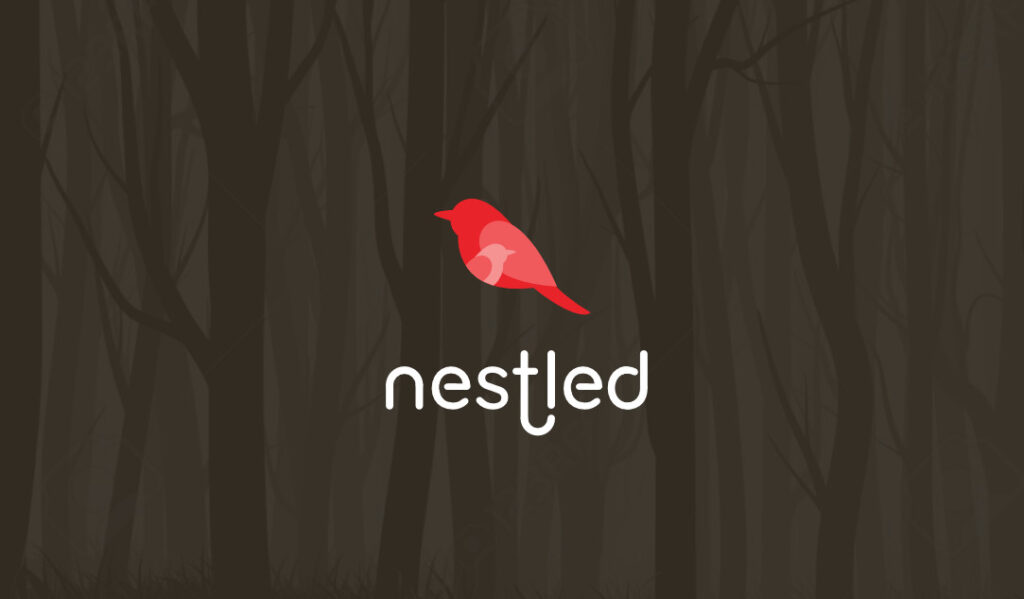
I don't usually create logos for clients, but I occasionally get to wander into the interesting world of logo development. Working with a company named "Nestled", I developed these nature-themed logos that featured depictions of animals being all cozy and, well, nestled. Of several options, these were the two I passed along to the client. They liked them both, so much they used both for their new business cards -- some cards featured the birds, and others used the foxes.
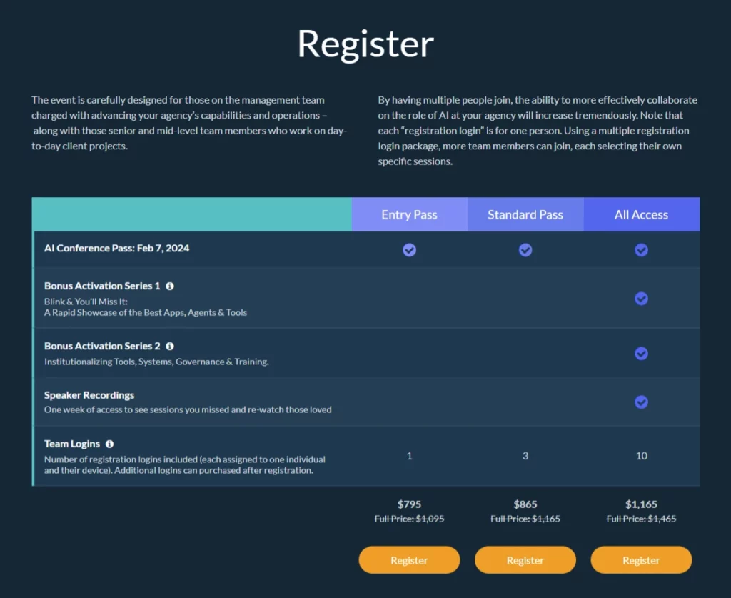
It's dark, and I love the interaction with the colors that we used for this conference website. I've been working on improving the registration process through several of these conferences, and this benefits grid is really starting to click together pretty nicely. It's fully customizable from the backend, and easy to change. We're still utilizing the Event Tickets Pro plugin to handle registrant data, but I'm currently looking into coding a custom solution, since it really just overcomplicates things, and we could create an even better registration flow if we move onto our own system.
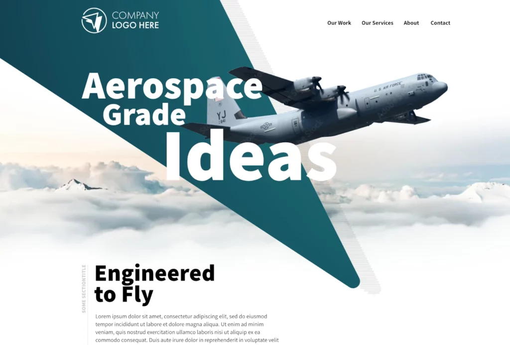
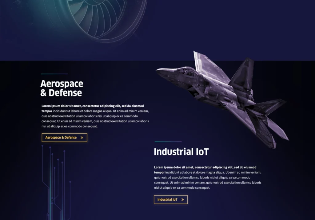
I've been working with a larger marketing and web firm that specializes in the aerospace industry. In this proposal for some updates to their own website, I'm having perhaps a little too much playing with the interactions between text, a piece of their logo, and of course, a great aircraft image. We'll likely settle on a more simple hero, without the use of the logo as an element, but I like this one a little too much to just leave it hidden in a folder on my hard drive somewhere.
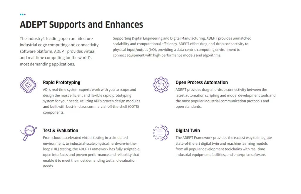
Even text-heavy sections can be interesting from a design standpoint. Adding in icons to break up the content is an obvious strategy (and I like how my custom icons turned out here), but I've also been playing with text sizing and arrangements. In this case, using an introduction sentence which I pull from away from the other text, and enlarge the font to create a hierarchy. Honestly, I would love to see an additional small paragraph under the paragraph on the right, just to provide more balance.
The beginning phases of a project are always fun. In the end, the client preferred a lighter version, but I loved the dark treatment as shown in this snippet from one of the original home page concepts. I liked how some of the high-tech detailing, such as the graphic in the bottom left, or the gradient bars above the section headings popped against the darker background.
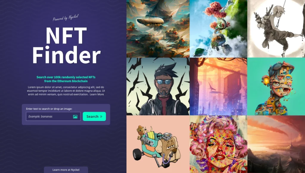
The great artwork on this NFT search tool is doing quite a bit of the heavy lifting with this design, but I am pretty happy with the high-tech color theme and some of the small graphic moves and elements that I incorporated into this design. In addition to the design, I built the app, which used the tech company's AI-powered image matching algorithm, allowing visitors to search for images based on keywords, or by uploading a similar image to what they're hoping to find.
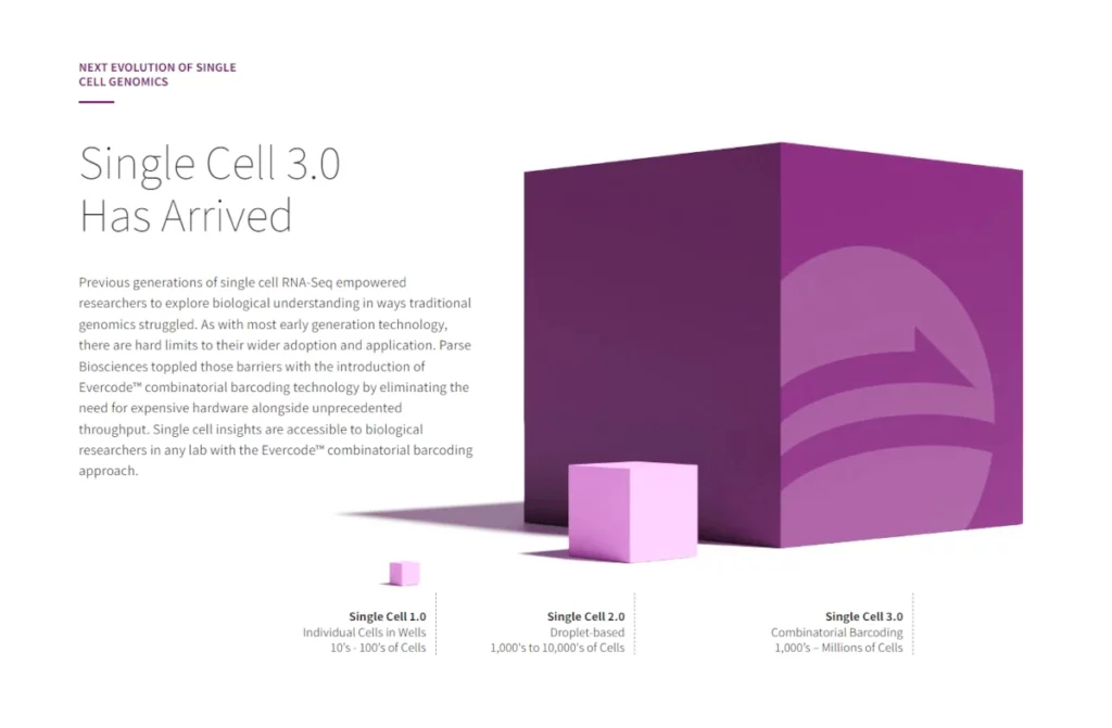
I like the overall arrangement of elements I built out for a section of a biotech company's website, basically just to show how much more processing power their technology brings to the table. For the boxes, I broke out some 3D modelling software and scaled things accordingly -- it's a simple rendering, but hopefully helps to illustrate the scale of improvement. I would actually love to work more 3D renderings into my work where it makes sense to do so.
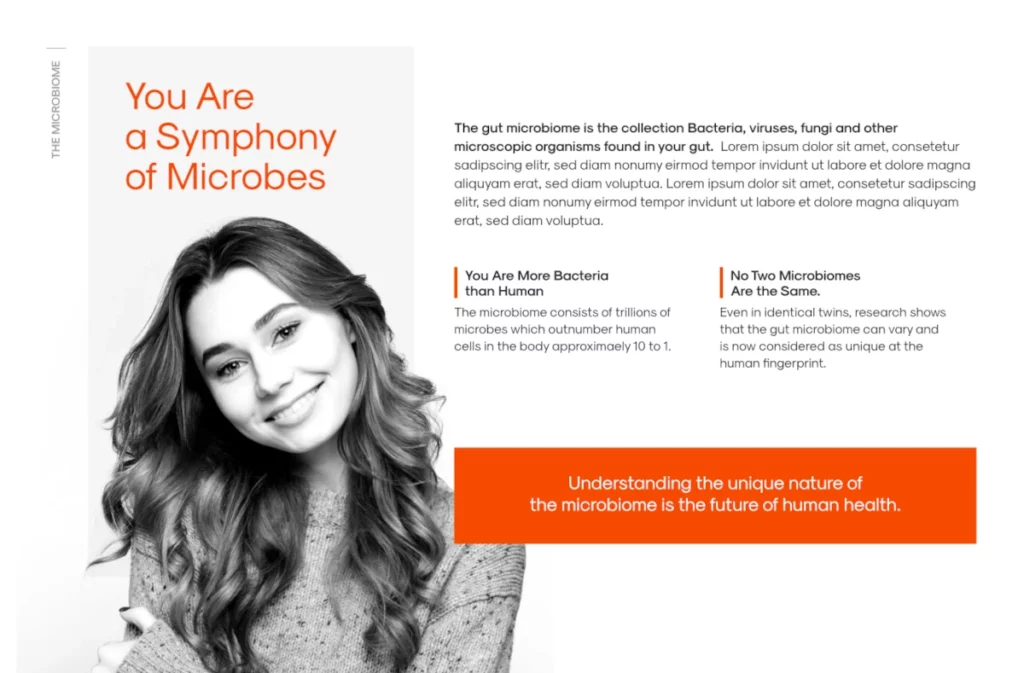
This biotech startup's main brand color is a pretty stark orange, which at times, can be a little difficult to work with. However, in this design draft for a section of a larger page highlighting the company's technology, it works pretty well. I turned the image of the woman to black and white, and pumped up the contrast quite a bit, which balances out the vibrancy of that orange which is used on accent elements and titles.
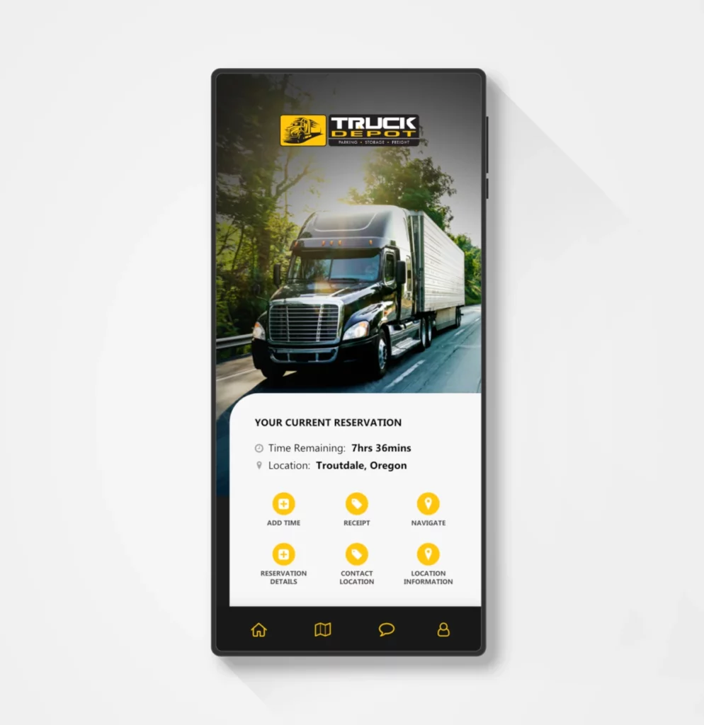
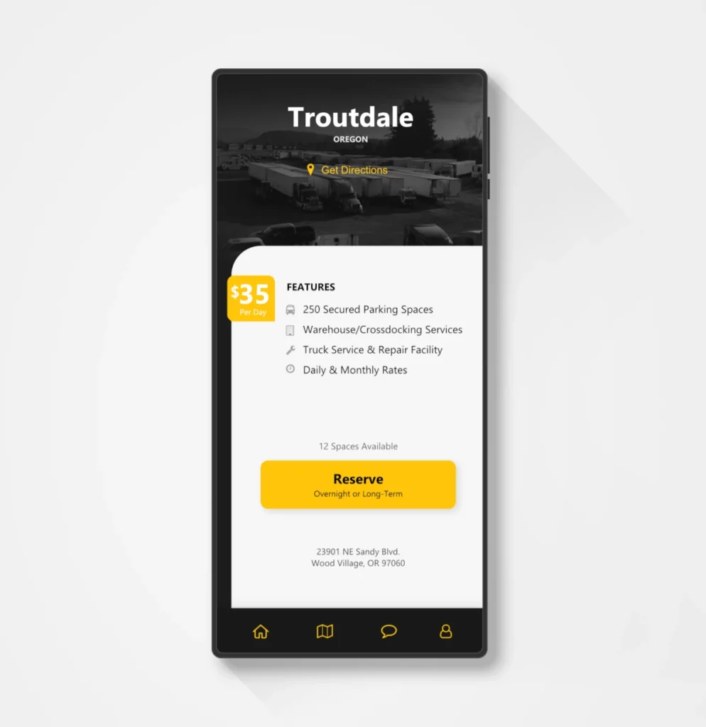
Just a simple app design for a long(er) term truck parking app. I think it's just a solid design that presents the information and prompts the user in a clean and minimal fashion.
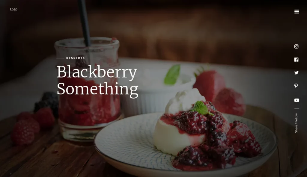
For a little while, I was working on a website/web app for a fairly prominent celebrity chef. Nothing ever came of it -- the project just kind of faded away. But for a moment, I thought I would be creating a pretty spectacular website with incredible food imagery. I enjoyed creating this early mockup for a section of the site -- one of a few designs that never went anywhere.
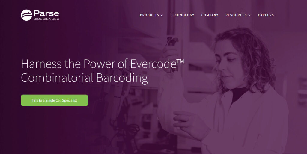
Hero sections can get pretty busy and complicated, but I'll always prefer simple and clean design. This hero follows the same design as all of the other hero sections on the site, but there is something about the image that just really works well for me here, and the green button really pops against the purple backdrop.
Just a typical section within the home page -- but I really liked this testimonial style that I created. This is another one of those sites that never ended up going anywhere, but someday I'll have to pull in this testimonial style for another project. This also illustrates my usual trend of cutting out imagery, and blending it into the page (so many designers just plunk images onto the page, which sometimes works, but I like a little more "flow" in my designs, where page elements blend and transition more elegantly). In a future round, I would work on cutting out her laptop instead of fading it out -- I prefer not to fade out objects as I've done here.
Good imagery often times makes my job easier, but even in then, it still can take some work to get things to a level that I'm happy with. This hero image started with a great image, but I took the time to cut pieces out, fading the backgrounds, and getting it to elegantly blend with the white background on each side (this is especially important for those who view the site on larger monitors). I also arrived on a design that incorporates a two-color title, which makes the messaging come through more clearly, and just adds some interest to the section.
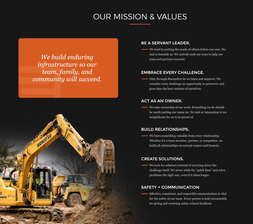
It's kind of cheating when you have great, engaging imagery to work with. The challenge for much of the imagery on this construction company website was integrating the images into the dark background (cutting out light-colored imagery against dark backgrounds can be difficult). I like how this one turned out, in addition to the design for the other elements within the section.
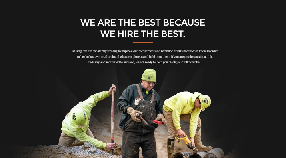
One of the main goals for this site, as it is for many construction company websites, is to entice quality employees. For the careers page, I designed this graphic by combining three distinct images to create a more visually engaging element. I'll often times do quite a bit of image work to make the best with subpar imagery, but in this case, there was plenty of great imagery to work with, which makes my job quite a bit easier.

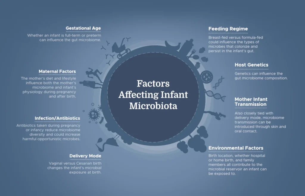
I designed a series of onboarding screens for users who just created their accounts at this bioscience company website. Working with their existing branding, I created additional elements to add a little interest and life to the process.
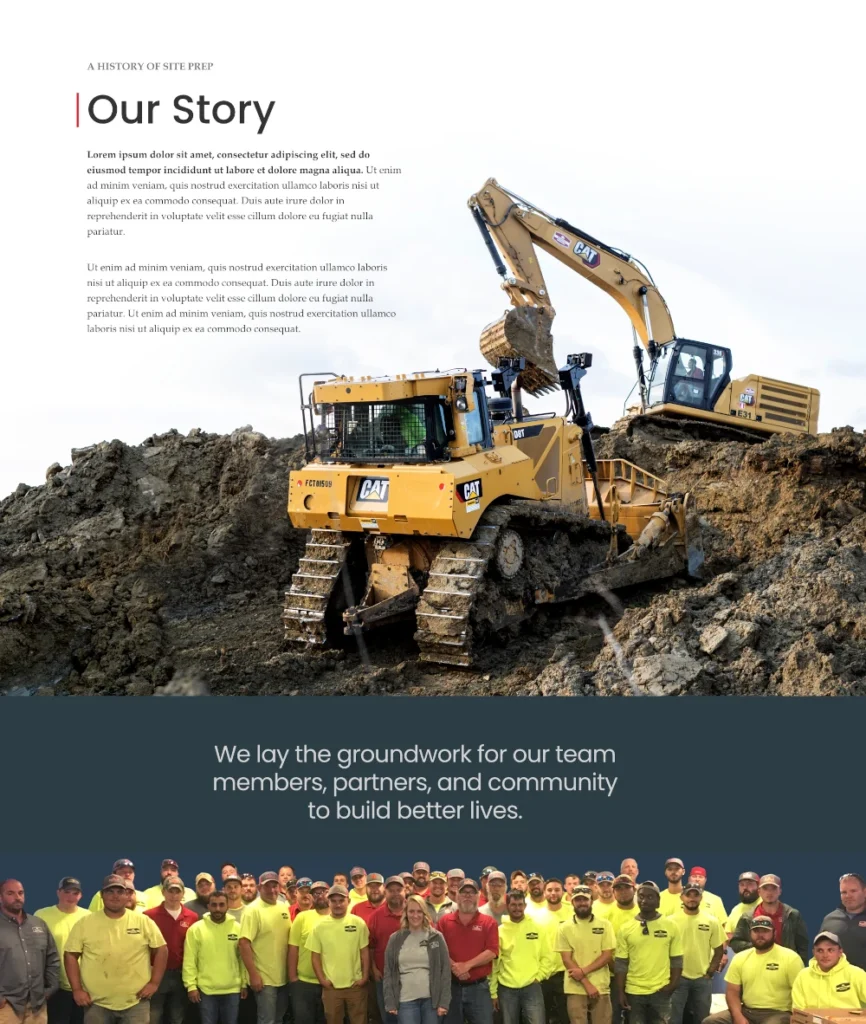
The photography for this construction website was fantastic. This image in particular was especially dynamic. I worked on it quite extensively to fully integrate it into the page, which required some work removing the background at the top of the image, but the result I think is quite interesting.