Responsive Web Design Services
With my advanced technology, high-level design, and attention to detail, you can be confident that your website effectively communicates with potential customers and clients, whether they’re viewing it on a mobile device, desktop computer, or something in between.


The Importance of Responsive Web Design
Responsive web design, the ability for a Website to be optimally viewed on a variety screen sizes, is essential for every modern website. There is an art and science to responsive web design, and some freelancers and firms don’t quite get it right. It’s a mixture of the technology that I have developed, an attention to detail, and the pursuit of creating the best websites for my clients, that allows me to build responsive websites and pages that perform the best, and are less expensive to develop.
There are a variety of reasons for ensuring your website is optimally viewable from any device, from user friendliness and usability, to search engine optimization, and especially conversion optimization.
Every website that I build is responsive, it’s just part of the process of design, and is a foundational aspect of my proprietary framework for building websites. As I build your site, I constantly check for various alignment and placement issues across all screen sizes, and perhaps more importantly, ensure that your message is optimally conveyed, regardless of the size of the screen.
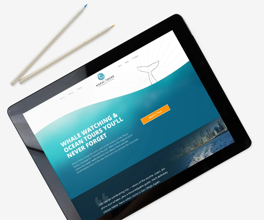
Responsive Website Design Done Better
Better
Technology
My framework for building websites ensures that I have greater flexibility and control in how the layout updates based on the screen size. This also increase the speed at which I can build, reducing your costs.
A Detailed,
Precise Approach
I also tend to devote a little more time to the process than most, ensuring the even the small details of how a design reorganizes itself for a different device are thought out.
Mobile, Desktop, and
Everything in Between
I design not only for the common device sizes, but I ensure every possible viewing size for your website has been reviewed and optimized.
The Importance of Responsive Web Design
Your Website Works on Every Device
Ensures visitors to your website have a seamless experience whether they’re on a phone, tablet, or desktop.
First Impressions on Mobile Matter
More than half of web traffic comes from mobile devices, so a great small-screen experience is essential.
Faster Load Times Keep Visitors Around
A responsive site is optimized for speed, reducing the chance visitors leave before your page even loads.
Better Search Engine Visibility
Search engines like Google prioritize mobile-friendly websites, helping more potential clients find you.
Creating a truly responsive website that works across all screen and
browsers does take additional time and an attention to detail. But taking the extra effort to do it well pays off in the long-run as your content will be easier to find in search engines, your visitors will have an easier time interacting with your site, and you’ll reinforce your high level of professionalism and trust.
Recent Web Design Blog Posts
I write about a variety of web design topics, including thoughts and insights related to responsive design, marketing, and making the most of your web presence.
Web Design


Popular