Communicating Website Design to Developers
Every so often when working with developers or other designers, the topic of communicating website design to developers is brought up. Being both a designer and developer, I seem to have a unique view on how best to do so.
Bloated Apps, Pixel Perfection, and Wasted Time
Where we’ve gone recently as an industry is to develop overly-featured and unnecessary products for design, like Craft, Figma, and Adobe Experience Designer to try and give designers various tools to envision websites across different sized screens. In some cases, these tools allow designers to build fully responsive prototype websites, at which point I have to ask; why didn’t you just actually build it in code and save a lot of money and time? Some of these products even create (bad) code that they can give to developers, but which no developer would likely want to use.
Another approach is to use the existing tools to design a full range of screen sizes. I once walked into a large design firm, and was shown fully designed mockups, created in Illustrator, of the same page for five different screen sizes. I’m disheartened at the waste of time and money that such a process certainly produced. Honestly, in a lot of cases a designing a mobile and desktop view isn’t really necessary, at least doing full views. Focus on those tricky bits that don’t follow a typical pattern.
But it goes even beyond just communicating the responsiveness of a website — it’s just as basic as communicating with developers on where elements on the page go, along with their sizes, colors, and other properties.
Sometimes, the idea of “pixel-perfection” arises (a phrase which should send a shutter down anyone’s spine). Sometimes it seems as though developers think that they should measure actual pixel dimensions on my design. For somethings this is ok, but in most cases, the actual pixel dimension doesn’t matter — it just needs to behave in a certain way.
And that’s I think the crux of my view. We don’t need to design 4, 5 or 10 screens at different sizes, and we don’t need to develop a full website through some application before actually coding the full site. And perhaps designers just don’t just need to learn to code, as I’ve previously dictated (actually, I still stand by that, but I’m not going to get into it here). We just need to communicate behavior and design intent explicitly.
Communicate Intent and Behavior
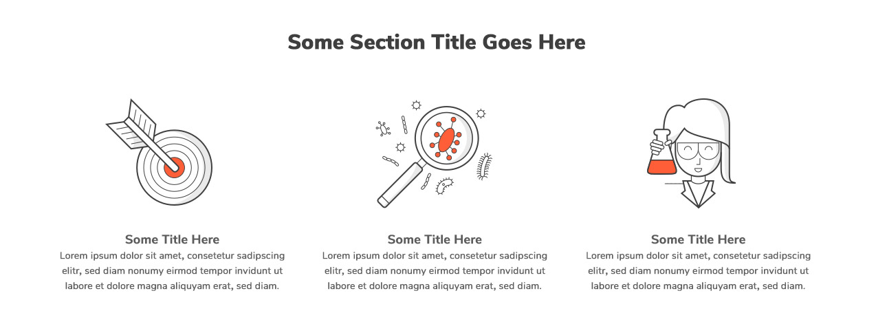
Historically, I’ve never been that good about communicating design intent. I would send a design mockup to the developers, and expect them to know what to do with it. Sure, it’s easy. Take the following example of three tiles:

I mean, it’s pretty easy, just make three columns, with some space between. Oh, and at some point when a user’s browser is below some set width, don’t make them align, but just stack them (I’m however not going to tell you at what point, just make it look good). Oh, and restrict the width of this section, so on larger monitors it doesn’t get all stretched out, but again, I’m not going to explicitly state the maximum width for this section.
The above is actually usually my approach — a lot of times however, I code my designs so I can get away with it, but when handing things off to a dev, that can definitely lead to some unexpected results, wasted expense, and frustration.
Taking a Page from the Architecture World
I’m actually trained as an architect, and a big part of architecture, surprisingly enough, is getting things built correctly. A first step is designing a great building, which is a fun and involved process, much like designing a website. A second step in the process is dimensioning your building plans so the contractor knows how big to make things and what has to align with what.
I think we’re missing that second step in the web design world, and in response we’ve found all sorts of inefficient ways and methods of trying to do what was solved in the architecture world long ago. We just need to dimension our designs, note intent, and dictate how things behave. The best part is that it’s actually really quick to do, cuts down on things I have to pointlessly design (tablet views??!), and I don’t have to buy any more expensive software to do it.
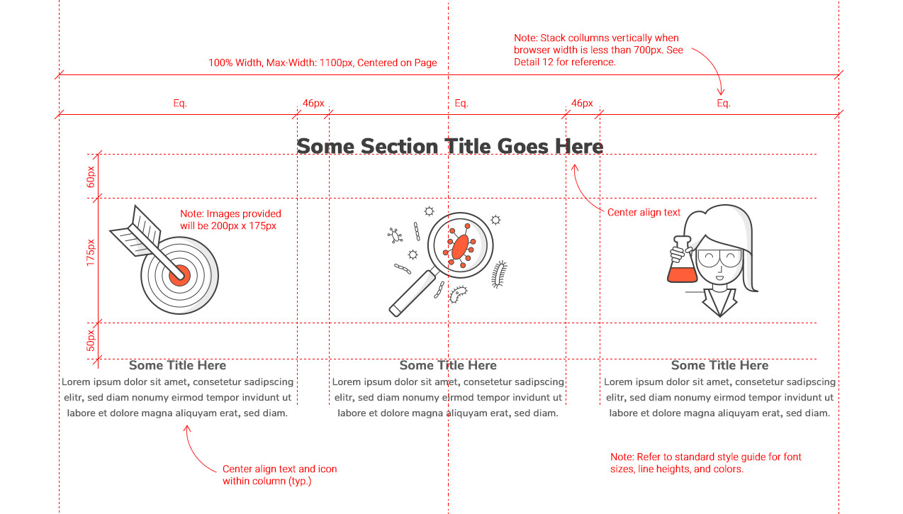
This is what I’m thinking…perhaps over time it gets standardized more, but just notes and dimensions that a developer can easily understand the specified intent, some dimensions, and behavior.

The above may look like a lot initially, but it really has everything (ideally) that a developer needs to code this section to behave as intended. It actually could make the developer’s process far more efficient, since they can easily look at this document and see sizes and alignments, without having to open the design file and take measurements.
A document like this could go a long ways in making the entire web design and development process easier, more efficient, and less costly. The finished dimensioned drawing also looks kind of cool too. That’s just an added bonus.
