Mission Hills Library
It’s been a couple years since the new Mission Hills Library moved from it’s former location, from more in the heart of Mission Hills, to the neighborhood’s eastern edge a few blocks away. And whenever I encounter the new library, I’m struck with a deep sense of disappointment and lost opportunity.
Its stone base, composed of beautiful river-polished stones, alludes to the clear, rushing mountain streams flowing from the rocky peaks and glaciers surrounding San Diego. The steel structure, painted brown and with details typically seen in wood beam construction, evokes the strength and beauty of the vast fir forests covering the San Diego county backcountry – those same firs integral to historic San Diego architecture.
Of course, none of that is true. We don’t have mountains, glaciers, mountain streams, or vast tracts of forest that have influenced our local architectural language. It’s as if this structure was flown in from some kitchsy mountain town in the Canadian Rockies, where the materials and treatment may not be fully honest, but at least attempting relevance. Here we don’t even have that.
I’m aware that the library is trying to tie back to the Craftsman style that can be found if you look hard enough around Mission Hills. And I’m aware that the stipulation on style was likely dictated by some misdirected board, or donors who wanted to have their say in the overall style. Regardless, it’s a building misplaced in time and location.
However, there are a few things to like about the new library. The entrance courtyard-ish area is approaching something interesting. The choice to have it interface more with Front street instead of Washington could lead to some opportunities. Since the street dead-ends at the library, I could see the street being taken over by events that also use the library. There is also a small outdoor courtyard on the eastern side of the building that could be a nice space to read and relax. It’s a great thought, even if the execution is lacking.
Other than the overall misplaced style of the building, the largest crime this building commits is how it connects to the street. Sure, Washington Street is a pretty busy and moderately fast street, but I can see a future where it is designed more like Washington a few blocks to the west, where trees in the traffic medians and architecture that engages the street help to create a calmer and more active pedestrian environment.
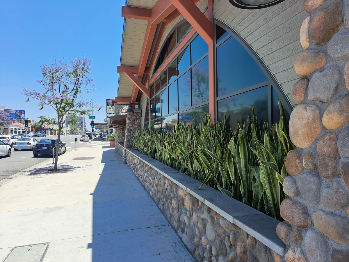
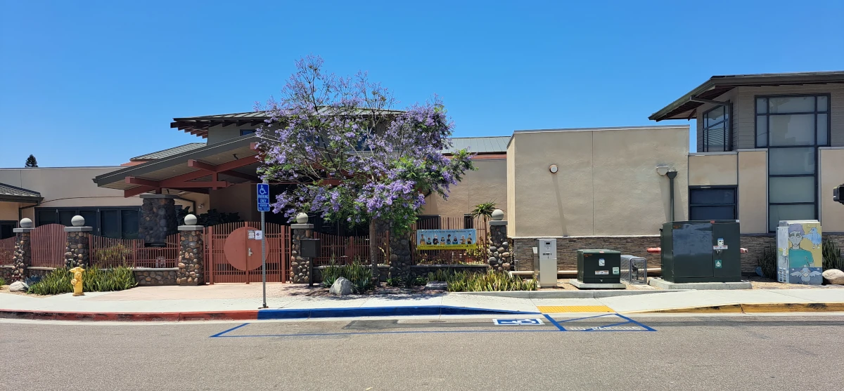
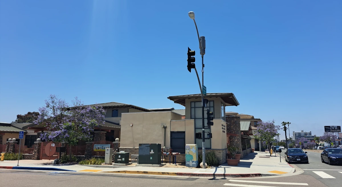
For the library block, we get a wall of stone, some plants, and a dark window which doesn’t really offer any meaningful connection between the library and the sidewalk. In reality, it’s just a blank wall on the street. The corner is dominated by a meaningless tower with fake windows – I guess there is some acknowledgement that the corner needs something solid, if for nothing else, to act as a place to put the name of the library on. At least the font that is utilized here is nice. The eastern edge of the property contains the entrance courtyard, but from the street, it’s a fence with some plants in front.
There are a few nice elements that could have been utilized more, and some opportunities that were fully missed with the new design. The Friend’s of the Library bookstore, which currently resides in a closet at the back of the property, could have been utilized to offer some life to the street. In times when more and more stores are going out of business due to online competition, any opportunity for retail would be welcome. How nice would it have been to have a small bookstore easily accessed from the street – a place to see the activity of people browsing the small collection of books.
The courtyard is an additional missed opportunity. It’s a great thought, but with the current execution, it’s almost missed. Perhaps it could have been a central feature, a unifying element within the entire design. A place that more of the library could utilize and spill out into.
It’s not hard to imagine an alternate design. A strong entrance to the library on the corner – a prominent entry instead of hidden behind a fence and recessed on the far less prominent street. Perhaps the Friends of the Library store is a beautiful jewel-box, utilizing some of the frontage along Washington street. We develop the courtyard concept further – forming a long space behind the storefront. It’s lush with plantings, and a place where you want to sit and read. Maybe the store is glass on both sides, allowing passer-bys to not only see the activity within the store, but through it, filtered by the store shelves, and into that interior courtyard.
The new library is a miss on quite a few levels, and the sting of the building is compounded by the reality that these types of opportunities hardly ever come along. Perhaps in fifty or sixty years, we’ll get another chance to do it better.