Error Notifications at the Issue Point
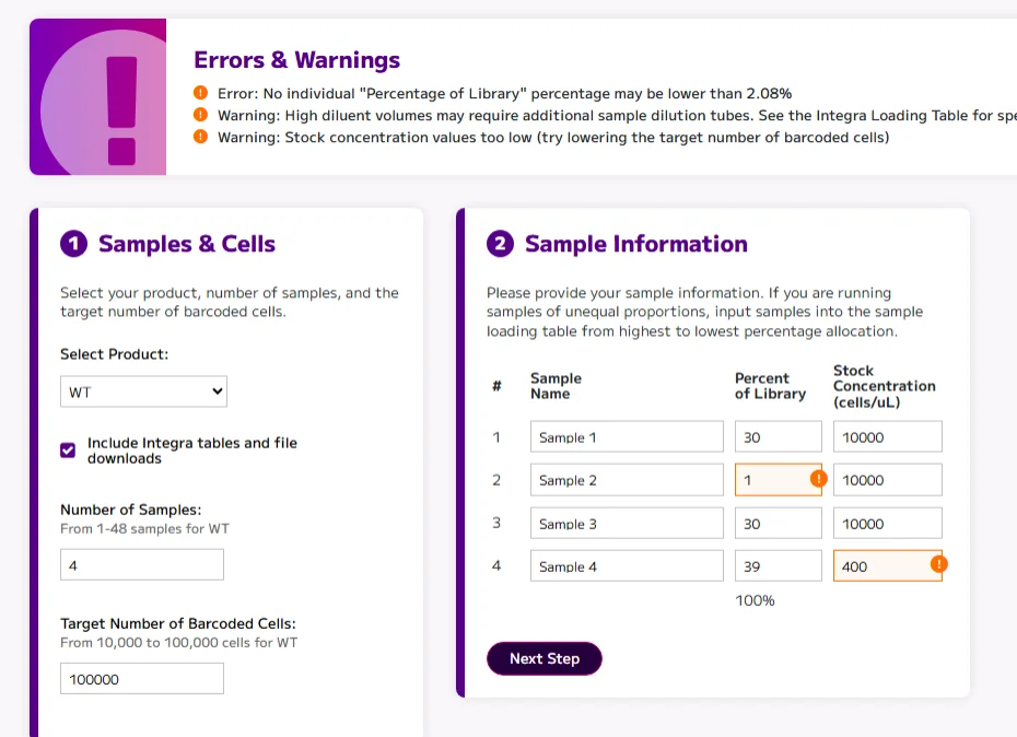
I’ve been building out a Sample Loading Table calculator application for a Seattle-based biotech company over the past several months. This application will help scientists with measurements related to loading biological samples into a well plate. In an act of minimal viability, I just added the errors and warnings to the top of the page, with a giant exclamation graphic to make it obvious that there were errors on the page. But the goal was also to add those alerts and notifications directly on the fields that were flagging the errors.
Initially as part of the initial validation development, I did highlight the problem input fields with an orange border and a slight orange background color, but I have always meant to return to the design and development of this section to make things even more obvious — to add an icon to denote the issue, along with the relevant error text as a mouseover, so it was easier to see the issue within the context of the page.

The “Errors & Warnings” will still exist at the top of the page as an overall summary of issues, but this update finishes the job of making it easier and more readily apparent for users to know where the errors are, and how to fix them.
