A Web Design Aesthetic Philosophy
Over my twenty-plus years in the world of web design, my style and skills have evolved. However, as my aesthetic has changed, I always rely on a set of foundational principles that I’ve developed and discovered, that form the bedrock of my web design philosophy. These principles form a design language that is flexible, but act as an anchor for most design decisions. Following these principles lead to successful projects that are not only beautiful, but also attain the goals required by my clients.
Sense of Flow
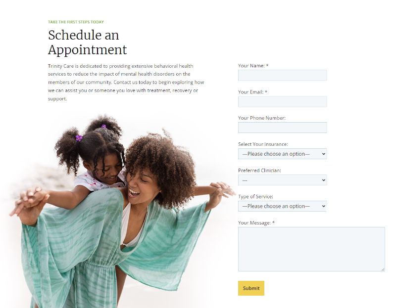
Successful websites lead visitors through their pages with as little friction as possible. Generally, the longer a visitor spends on a site, the greater the chance that they’ll be enticed to take the next steps, whether a purchase or inquiry. While not the only factor, a website that feels unified and connected from one section to the next and helps move the visitor through the page will often times lead to greater conversions.
From an aesthetic perspective, I strive to create designs that encompass this philosophy. It takes a little more time and effort – to work on imagery that isn’t just dropped in, but is treated in a manner that helps it become part of the page, as opposed to just an element on the page.

A Limit on Unnecessary Elements
As a young architecture student, I strongly identified with the modernist philosophy of form following function. That is, the beauty of a building is a result of the elements that make a building functionaly successful. In buildings, this may mean expressing the building’s structure, drawing attention to it and celebrating it. For any decorative moves, there has to be a reason for doing so. Later, post-modernism would appear to counter this philosophy – where decoration not really based on anything would appear on buildings – in some cases, literal bows would decorate buildings.
In web design, I think there is a little more freedom in terms of artistic expression, but I still hold onto the base of that modernist philosophy — the notion that random decoration and unnecessary elements distract from the messaging and that simplicity is better when trying to accomplish your website’s goals.
Certainly some decoration can be good – as long as it ties back into the branding, or if there is a strong reason for doing so, but you will rarely see random decorative elements in my designs, not only because I don’t care for the aesthetics, but because we should be focused on how your service or product is better than the competition, answering your client’s questions, and addressing their hesitations for taking the next steps. Everything on the website should work towards these goals, and often times, unnecessary decorative elements inhibit that goal.
Subtle Hints of the Overall Branding
Because I strive to create websites without unnecessary design elements that don’t have relevance, I’ll often times use subtle cues back to the company logo or other branding elements to add visual interest to pages. This may include individual graphic elements or even just borrowing a design move, like a slanted line or angle taken from within the logo. These subtle design moves can also help draw attention to specific messaging.
Designed for All Screen Sizes
Responsive design, the philosophy to create websites that adjust their layouts based on whatever screen size and resolution they are displayed on, was accepted as necessary long ago. But browsing numerous websites for small and mid-sized companies, it seems evident that this necessary design strategy isn’t generally fully realized on most websites. Most companies and freelance web designers at least seem to design well for desktop computers, and most mobile phones. However, the screen sizes between these extremes are often overlooked.
I design for desktop, mobile, and for the full range of display sizes in between. It’s not only important for those viewing on a tablet, or large phone, but also for those users on desktop computers who have shrunk their browser window down to an uncommon size in between. Perhaps they’ve shrunk a couple of browser windows down so they compare your offerings to that of a competitor, or to give them more room to make notes on your services. Either way, you want to ensure that your messaging reads and looks amazing, even at a non-standard size.
Since I design and code all of the sites that I build (as opposed to designing and sending the design off to a third-party for coding), I constantly test the responsiveness of pages across all sizes, noting where things awkwardly overlap, and make adjustments as necessary. I also have an advantage over those who use templates and website builders, where there are far few options for coding the site to behave in the ways it should. I have full access and control over the code of the sites that I create, giving me the opportunity to do whatever is needed to keep a website looking great at all screen and browser sizes.
Design with Text
It’s easy to build beautiful websites with nice imagery and illustrations, but there is also opportunity for creating appealing websites by utilizing fonts and text arrangements, which may include straplines (a small bit of text above section headings), bolder introductory sentences or paragraphs, and drop caps.
The alignment of various blocks of text can also be used to add interest, help with page flow, and in some cases, readability. Working with fonts, including colors or gradients, and even playing with a variety of font sizes can add visual interest, and in some cases apply a hint of deeper meaning.

Use Design to Highlight What’s Important
The design, both individual elements and overall arrangement should direct the user’s attention to what we want them to see, highlighting important information, answering their questions, and prompting them to take the next steps. This can be done in a multitude of ways, from the arrangement and directionality of imagery (such as an image of a peson gazing in the direction that we want), to subtle design cues from elements, the placement of dense and sparse elements, and the visual treatment of fonts and text.
My foundational design principles have stood the test of time, leading to numerous successful projects over my web design and development career. As my style and aesthetic changes with time, these principles still always form the basis for my design, ensuring quality websites that exceed the goals of my clients.
