Mega Menu Design Updates
I have been methodically working through website improvements for an existing website, and a fairly-important change has been to rework the navigation style, functionality, and capabilities for it. The existing design was new, but definitely needed some attention. There were a few important items to address with the updates:
Mega Menu Design – Unused Real Estate
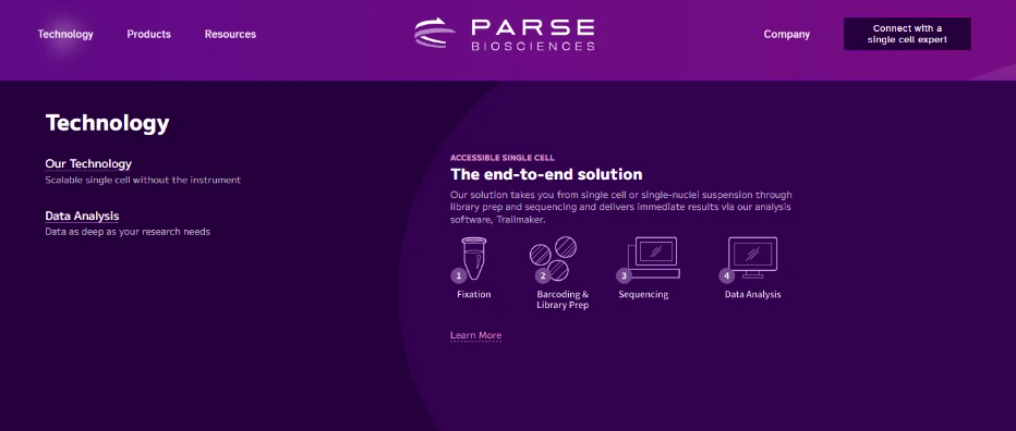
The original menu was used initially only for links, and while it worked acceptably well for sections of the website that had numerous sub-pages, the sections that didn’t have as much content were visually awkward, and it was easy to miss content as a result. For instance, the original “Technology” section only housed one link, which was lost in the wide swath of real estate, while being overshadowed by the introductory title and text of the menu.

Organization and Hierarchy
Especially for the products section of the site, the organization and hierarchy of products needed improvement. This issue was compounded by the addition of new products and offerings that were being added to the website.
Missing Opportunities
Overall, we felt that there were opportunities being missed for highlighting products and information that could help drive additional sales. This was especially the case on the sparser mega menus, where the vacant real estate could be utilized to a much greater degree.
The Design Solution
Redesigning the mega menus took a series of steps. We wanted to fully utilize the open space present on many of the menus, which was fairly straightforward, but we also wanted to ensure that each section had enough links to justify the use of the larger menu format. The only menu that really need work in this area was the Technology menu. While the original design only highlighted a single link, there were actually two links for the section — the “Technology Overview” page, which was linked under the introductory text. The updated design fully utilizes both links in the section, which definitely feels better. Over time, we’ll also add additional pages within this section.
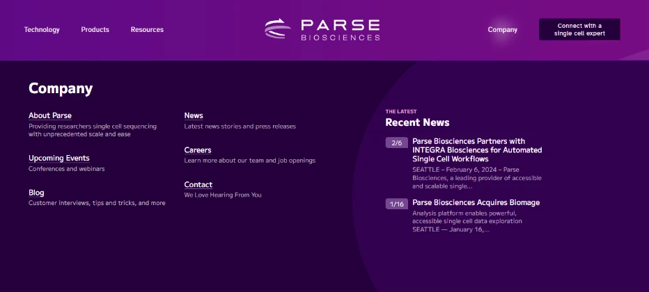
For some sections, we had the opposite issue — we didn’t quite have enough space for everything we wanted to add. We decided the best course of action was to remove the introductory text for each section. This gave us more space to work with, which we needed for the standard “highlighted content” section of the menus.
There was a desire to have a highlight the new Trailmaker software created by the company — it was actually one of the main reasons leading to the updated mega menu designs. This led us to find uses for similar sections on the other mega menus.
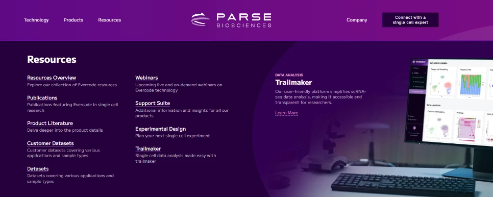
The mega menu updates also included the ability to add short descriptions for each link item. This provides some visual weight for each link, as well as giving the visitor a little more context before clicking through to see more details.

The mega menu redesign was a pretty beneficial update that had a positive effect on the sites appeal, usability, and conversion rates. Over time, we’ll likely continue to modify and improve these areas as the needs of the company changes.