
UX & Web Design #4 – Home Page Hero Design and Improvements for Informational Sections
I was able to do quite a bit of design work this past week. These are some of the highlights, but I have some additional items I’ll probably post in the next week or two for some things that are still in progress.

A Simple, Clean Home Page Hero Design
I’m not sure if we’ll end up heading in this direction for the home page hero, but I liked the cleanliness and simplicity of this initial, quick draft. The angles are taken from their branding, and I may have to add it some more orange/red elements to work with their design language, but this was a fun first pass.
Minor Website Enhancements and Updates
Sometimes things get added into a website, with the full intention of getting back to them at some point to enhance and make them better.
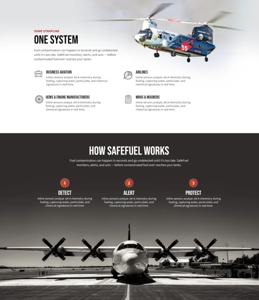
A while ago, we created a full landing page at a separate URL to highlight a specific product, and it was very much an instance of “how fast can we get this live,” and so many of the sections we’re really just dropped into place without really giving them any level of design. In fact, they were just two sections, aligned horizontally, with some text a bullet-list for each.
But now we’ve been working through some of these sections on the site, working on design, and in general, just making the page more engaging. It’s always a fun process making things better, and I’m pretty happy with how the update of these two sections are coming along. It of course helps when I have pretty amazing imagery to work with.