
UX & Web Design #7 – Conference Website Home Page Benefits, Highlighted Content
Just a couple simple design updates for this round of UX & Web Design. Sometimes it’s just the small touches and little refinements on a website that pull things together.
Conference Website Home Page Benefits
On an AI Conference promotional website, we needed an attractive way to cover topics covered and some of the featured content and benefits of the event. This is one of those areas where icons or images to highlight each would be pretty nice, but since these change from conference to conference, and to keep costs to a minimum, we wanted a more generic treatment.
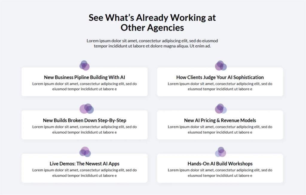
I had previously started playing with this overlapping circles graphic elsewhere on the site. Just one of those design elements to bring some interest to the page, especially where there isn’t a good option already. Over the long term on this site, I’ve been trying to start developing a more thorough design language, little elements like this that can be dropped in, or riffed on elsewhere. I kind of like the metaphor of the overlapping circles — the idea of people coming together for these conferences, mixing, and bringing various viewpoints to a common place.
Since this template is used at multiple conferences for this company, I’ll likely create a set that matches the color scheme for each, and just make it easy to swap out.
Highlighted Content Element
We needed a new page which highlighted a new partnership between our client, and another aerospace company. The rest of the page is a little less visually interesting, but for this section, I wanted to create something with a little more visual interest.
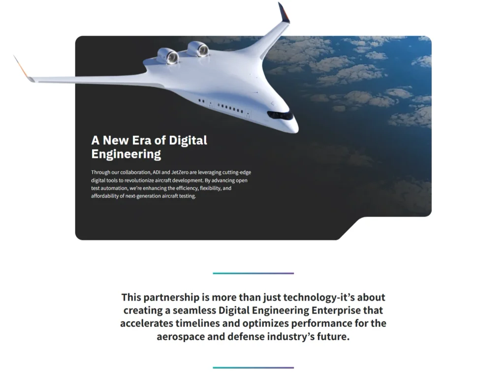
This rounded rectangular shape was introduced a few months back, which helped add some visual interest throughout the site, but in this case, since I had this cool futuristic jet to play with, there was an opportunity to make things even more interesting by having it break the boundaries of the box element.
I was able to pull out some highlighted text from the provided content as well. It’s a simple text treatment, but definitely helps break up the page a little more, making it more readable and adding visual interest.