UX and Web Design Summary #1
I always enjoy looking through my past work, and so it seems like a good idea to regularly create a post to highlight some of the things I’ve been working on over the past week or two. In this roundup, I got a hero and intro section to a page that turned out more interesting than it otherwise would have, just because of a design constraint, a website that’s darker than anything I’ve done in quite some time, and some UX things.
A Simple Hero Design
A few weeks ago I designed a Certified Service Provider detail page for a biotech company. It’s one of those instances where the design became more interesting due to constraints. In this case, logos are generally most available on a white background, but I still liked the idea of having a bolder hero section, so I started looking for ways of having a split — a darker, bold section for the page title, with a portion of it reserved for logos. Since this company works with cells and RNA, I incorporated a circle shape, which occurs frequently throughout the site.

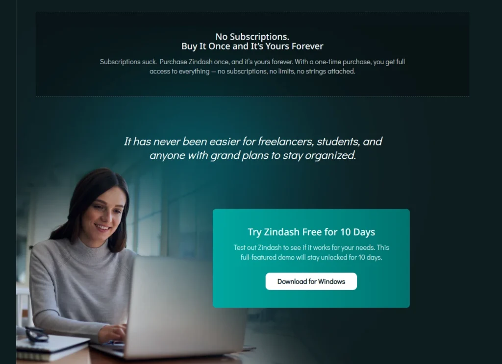
A Dark Website Design
It’s been a while since I’ve been able to create designs for a darker, moodier website. This one has been fun. The overall site is still very much a work in progress, but it’s been fun setting off some vibrant colors against the dark backdrop.
Line Graphs for a Web App Interface
This is actually just a little personal project, but I really like the way the graphs turned out. Actually, I stole them from a past project of mine that utilized this style, but I repurposed the dot plots with a gradient trend line, which I just really enjoy. I can see the actual data (when hovering over one of the dots), so the detail is there, but it’s also just really easy to see what’s going on overall (and yes, I need to get that body fat back down and the lean body mass back up).
